Re-Design of Zara.com
Although I’m a researcher at heart, UI/UX research is only useful when it’s applied to enhance good design. As part of my coursework in the Masters in Human-Centered Computing at the University of Maryland, Baltimore County, I’ve learned to apply the principles that make up that “good design” by re-designing existing websites.
Challenge:
Identify and remediate issues for the following design principles: visibility (or discoverability), feedback, constraints, and consistency.
Process:
I conducted a heuristic review of the first three navigation levels of the Zara e-commerce website, collected screenshots and annotated them with evidence of design issues. Re-design wireframes were created in Figma to build experience with design software.
Visibility Issue: Hidden ‘What’s New’ link
Key features (search, cart, navigation menu) are presented in high contrast with the background.
However, the entire background is actually a link to new items — a hidden affordance that you might only notice if you pay attention to a change in cursor state.
Solution: Make the link dynamically visible
This hidden affordance is an important missed opportunity for Zara to show users how to purchase the new products highlighted on the screen. In this re-design, when hovering over the photo, a “What’s New” navigation link will appear
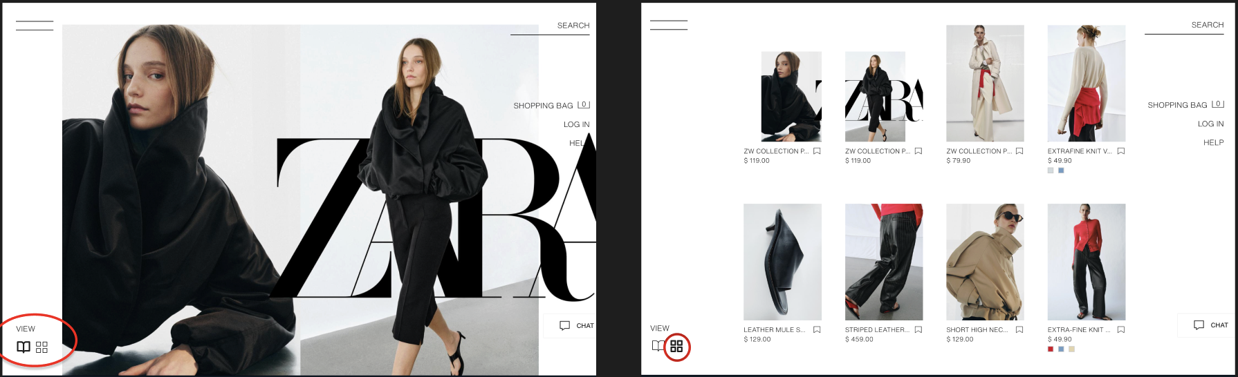
Clicking on the link from the landing page to the “Women’s Just In” product page produces very little feedback that you have arrived on a page with items for sale. The labels in the view selection are ambiguous: do the numbers refer to different view types or additional pages of items?
Feedback Issue: What’s for sale in What’s New
My re-design improves the feedback on this page through the choice of icons: an “open book” for a catalog-style, large image format and a grid icon for the grid view with additional information. I use a heavier weight to indicate the active view; when another view is selected, the inactive view changes to a lighter-weight variant.
Solution: Indicate when you’re in catalogue mode
I discovered, when browsing the Jeans sub-page, it was possible to select filters that create a state with no results - the filter options did not adjust based on the availability of items that matched all of my filter selections.
Constraint Issue: Searching for items that don’t exist
For my re-design, I would create dynamic menus that would only show filter options for products that exist. If a previously selected filter eliminated a possible option (for example, Zara does not currently sell any size XL pink wide-leg jeans), then the filter menus would dynamically adjust.
Solution: Hide options that don’t exist
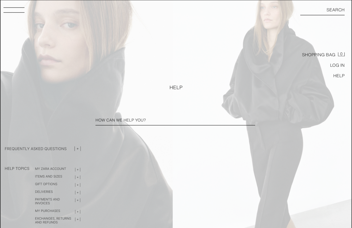
Consistency Issue: Help section headers
On this website, most of the interaction elements are text-based. For example, the product navigation menu is organized with vertical columns and also uses font changes or to indicate hierarchy. In contrast, the frequently asked questions (FAQs) and Help Topic menus are organized horizontally across the bottom of the page with topic headers in the same size font as article titles, limiting their utility for showing hierarchy or helping users skim headers.
Solution: Text-based accordions for hierarchal help articles
In my re-design, I re-organize the help article navigation to vertical columns with larger font sizes for higher-level headers (retaining internal consistency with other menus). The text-based formatting of the plus sign icons retains internal visual consistency with elements like the shopping bag total.
Reflections:
E-commerce websites have existed for over 30 years and there are countless design examples iterating on successful patterns. Still, there is always room to review, test, and polish any rough edges at any point in a site’s launch. Even a student can provide a fresh set of eyes for spotting those rough edges.