Student Design Process Assignment:
Re-Design of Microsoft Copilot Interface
Challenge
I worked with a team of fellow graduate students (Rachel Rivera & Gini Tong) to re-design the web interface for Microsoft Copilot. Companies are competing for users’ attention and loyalty as more GenAI models, interfaces, and features become available for free or a low-cost subscription. While Microsoft can raise awareness of Copilot through other Microsoft products, keeping users engaged requires an interface that is easy to learn and supports users’ exploration of Copilot’s capabilities.
Process
For this design sprint, my group carried out the following steps over two weeks (April 16-30, 2026):
Define and empathize with target user population, identifying issues from the user perspective.
Ideate and sketch two solutions for three issues.
Converge and determine the best design solution.
Create a working prototype.
Test the prototype with individuals from the target user population.
Revise the prototype based on user testing results.
Issues Identified
Our team defined our user audience as “adult students who want to use GenAI to simplify open-ended, search-heavy tasks like shopping.”
Using divergent thinking at this stage — uncovering the largest number of issues — also helped us converge on solutions that could solve more than one issue.
Sketches and Prototyping
Keeping that audience in mind and with several issues to choose from, our team independently sketched out solutions, a sample of which are included below:
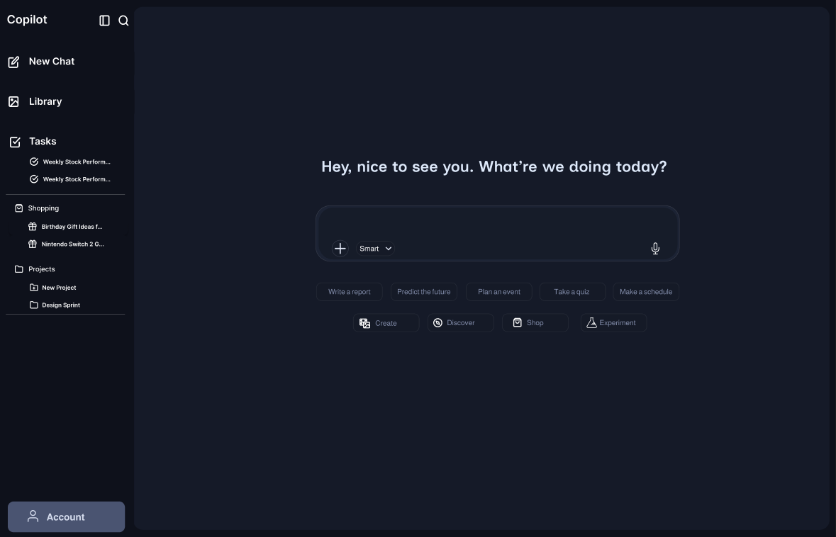
Our team identified several issues in the current side navigation that impacted the goal of “simplifying searches,” including poor information scent, inconsistent behavior, and poor visibility. For our re-design prototype, we chose to focus on the landing page and a sample shopping task, since this is an application that is highly relevant to our audience. (We imagined our users, after a day of homework and reading, would dread having to start yet another research task for a birthday gift.)
Prototype v1:
Re-design the sidebar for storage, not suggestions: In our prototype, we re-design the side navigation as clickable buttons under the “New Chat” box. This addresses poor information scent as well as improved target acquisition. Now, the sidebar functions as a history and file system for saved searches.
Improve visibility and information scent on the different features of Copilot by placing the structured prompt options previously in the side navigation (Create, Discover, Shop) to below the chat input. This addresses a Gulf of Execution: What can I (quickly) do with Copilot?
Add feedback to help users more-efficiently iterate on a prompt: Create quick-access buttons within the results of a prompt category (“Shop”) that shows how users can build on past prompts and event purchase history. Additionally, this redesign shows how past searches get saved in chat history displayed in the side bar. This addresses both the Gulfs of Execution (“How can Copilot help me shop?”) and Evaluation (“Did my shopping search get saved, and if so, where?”).
User Testing and Refinement
To test our assumption that the re-design would improve the visibility and efficiency of shopping tasks, we built a high-fidelity wireframe prototype of Copilot’s desktop web interface. We focused on a single time to complete metric for a shopping task and recruited peers who were students (or busy professionals) for testing.
Users were asked to carry out the following task while an observer recorded the time to complete:
“You’ve used Copilot to search for a Nintendo Switch 2 [or previous saved search, for live Copilot] and now you want to buy it. Show me where you would go in Copilot to find a purchase link.”
Users first carried out the task in either the prototype or the live version of Copilot, then switched and repeated the task. This helped reduce the effect of learning the interface on the time to complete measure.
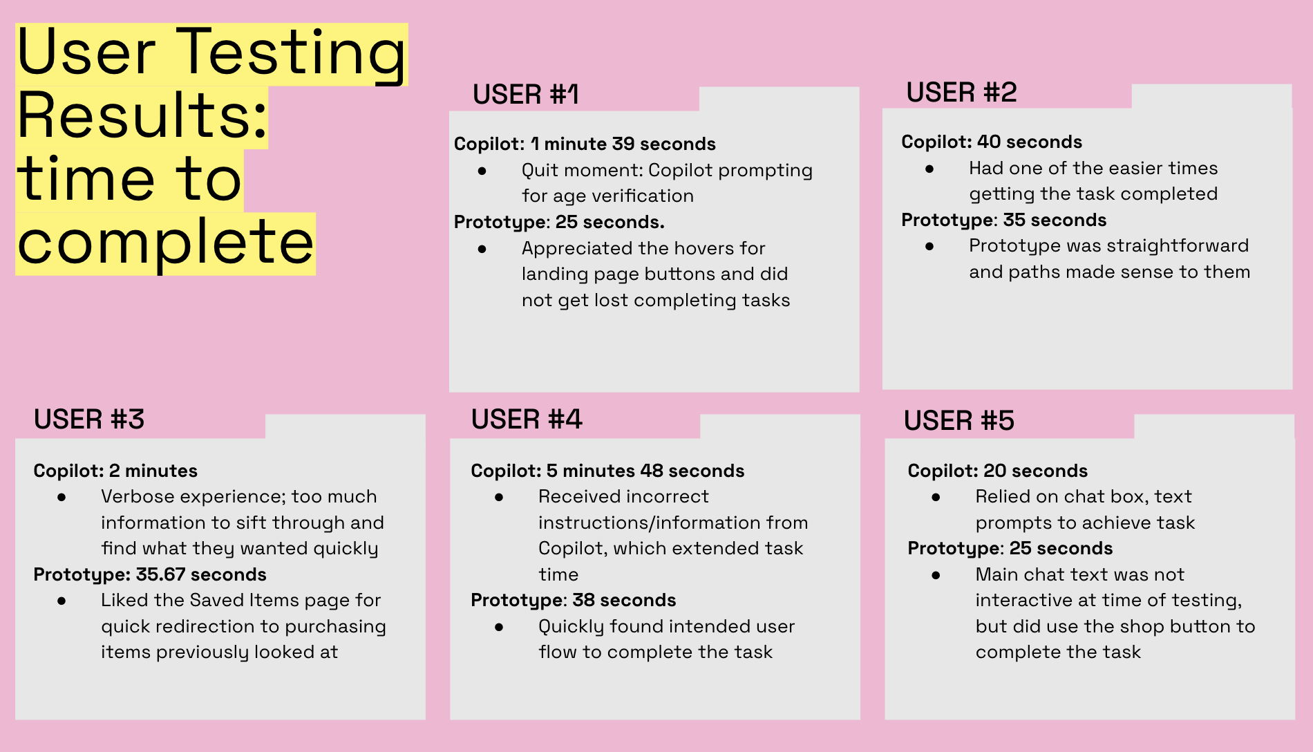
Except for one user who completed the task very quickly using both versions, the prototype performed better on time to complete. While some of this may be due to the wireframe’s constraining possible behaviors, users shared their frustrations with the open-ended, prompt-first approach they used in the live version.
Reflection
One of the behaviors we observed in testing, with major implications for interface design, was the “prompt first, then refine” approach our users took. Users went directly to the generic prompt field to ask Copilot to carry out a version the task they had just been asked to do rather than exploring the interface. In a larger-scale test, including tasks that explicitly tested the interface (such as logging in or adjusting settings) would illuminate the effect of interface tweaks. First-click testing could also be used to validate the hypothesis that genAI interfaces focus user attention on the prompt interface first, possibly to the extend of ignoring the other sections.
In future iterations of the prototype, suggesting prompts based on past behavior (such as returning to an unfinished shopping session) in the prompt window could help users more effectively carry out the prompt-first approach that genAI interfaces invite.